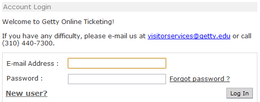
I recently went to the Getty Villa website to get some tickets and came across their login/registration screen. Sadly, their page looks like the type of examples used in hyperbole-filled academic books on how NOT to design the login page. The notes defined here can be applied to most any user interface design.
Consistency of Design
There are three options associated with this part of the user interface: Log In, New User (registration), and Forgot Password. These three ‘associated’ features each have a different visual design. I’m not saying they should all look the same, but the differences in size, bolding, placement, and inconsistency of spaces made for a confusing UI.
The right edge of the ‘Log In’ and ‘Forgot Password?’ buttons should be flush. Personally, I would have placed the ‘New User?’ (what’s with the question mark?) above the log in box. This would allow the UI to explicity differentiate between new and existing users.
